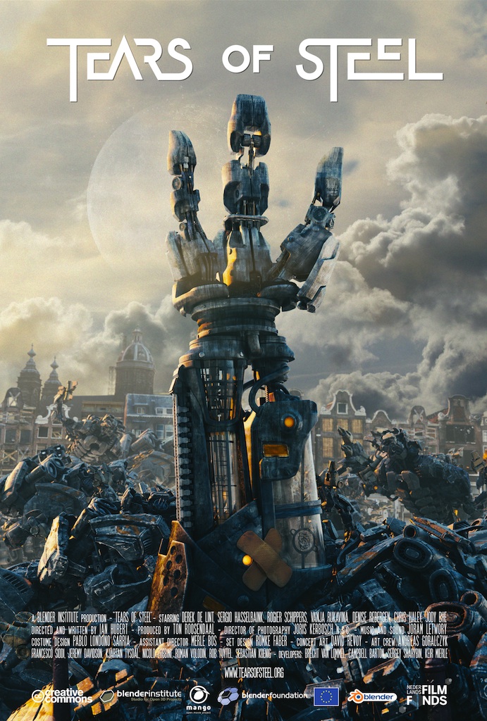
Some of the posters that I am considering taking inspiration from would be from various short films that focus around similar subjects, i.e. sci-fi, robots, machinery and the cold winter themes that run throughout the setting. for the poses and object arrangement within the poster, I will take a look at the following posters:


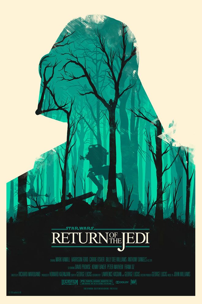
These give a large range of ideas for inspiration in terms of how the poster should be structured, but for the styling of the poster, I will be taking a different route. A style that makes for a very simple but eye-catching poster is using minimalist styles to represent the film, with basic colours and shapes. Alongside this, a large amount of minimalistic posters make a use of negative space to represent an image within the image, while not directly depicting said image. This is done more through the lack of imagery within a certain area (such as the posters demonstrated below).


Using a combination of these styles, I believe that the poster will conform to the conventions of object arrangement within the poster, but that the styling of the poster will help to set it apart from other short film posters.