Tuesday 19 April 2016
Monday 18 April 2016
Sunday 17 April 2016

Saturday 16 April 2016
Evaluation Question 1 - In What Ways do the Media Products Use, Develop or Challenge Forms and Conventions of Real Media Products?
In What Ways do the Media Products Use, Develop or Challenge Forms and Conventions of Real Media Products?
Throughout the process of creating my products, and the development of the short film, I have attempted to keep the products as professional as possible. In order to do this, I decided to stick to conventions for the most part, but still wanted to allow my creativity to come through, and therefore broke some conventions in order to keep the content of the short film fresh and different. Within this evaluation, the conventions and how they are broken or conformed to within my short film, poster and magazine spread will be analysed to show their usage or breakage of conventions.
The short film has conformed to a large amount of the conventions within the genre and medium, but has still broken conventions of the form itself. The reason I chose to break conventions was due to wanting to make the short film slightly different in order to keep it as something new, within reason. some of the conventions that exist within this products are based around it's narrative ability and environments. Often in science fiction short films, snow and icy conditions are used in order to present a setting that represents the rough lives of the main characters, but in my film I used this setting to forward the plot through showing what the protagonists could do, which would become important later on.
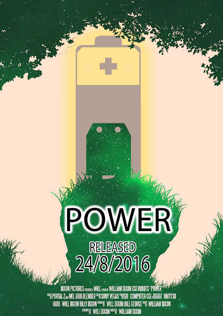
 In my poster ancillary text, I have opted to use the conventions found within a large amount of posters of displaying the main character in the center and an object of plot importance in the background behind them, with surrounding scenery and borders covered with a similar theme to the main setting of the film. In this case, I have used trees and grass around the edge to create a boarder, to which the character is in the middle. The battery, an important plot point in the film, is shown as very large and behind the main character, with a glow around it to draw the viewer's attention to it as the main focus of the film. This is conventional, and through researching the products i learned that these positions are common not only on short film posters or even posters of the genre, but that they expand to other genres too, such as action and adventure films.
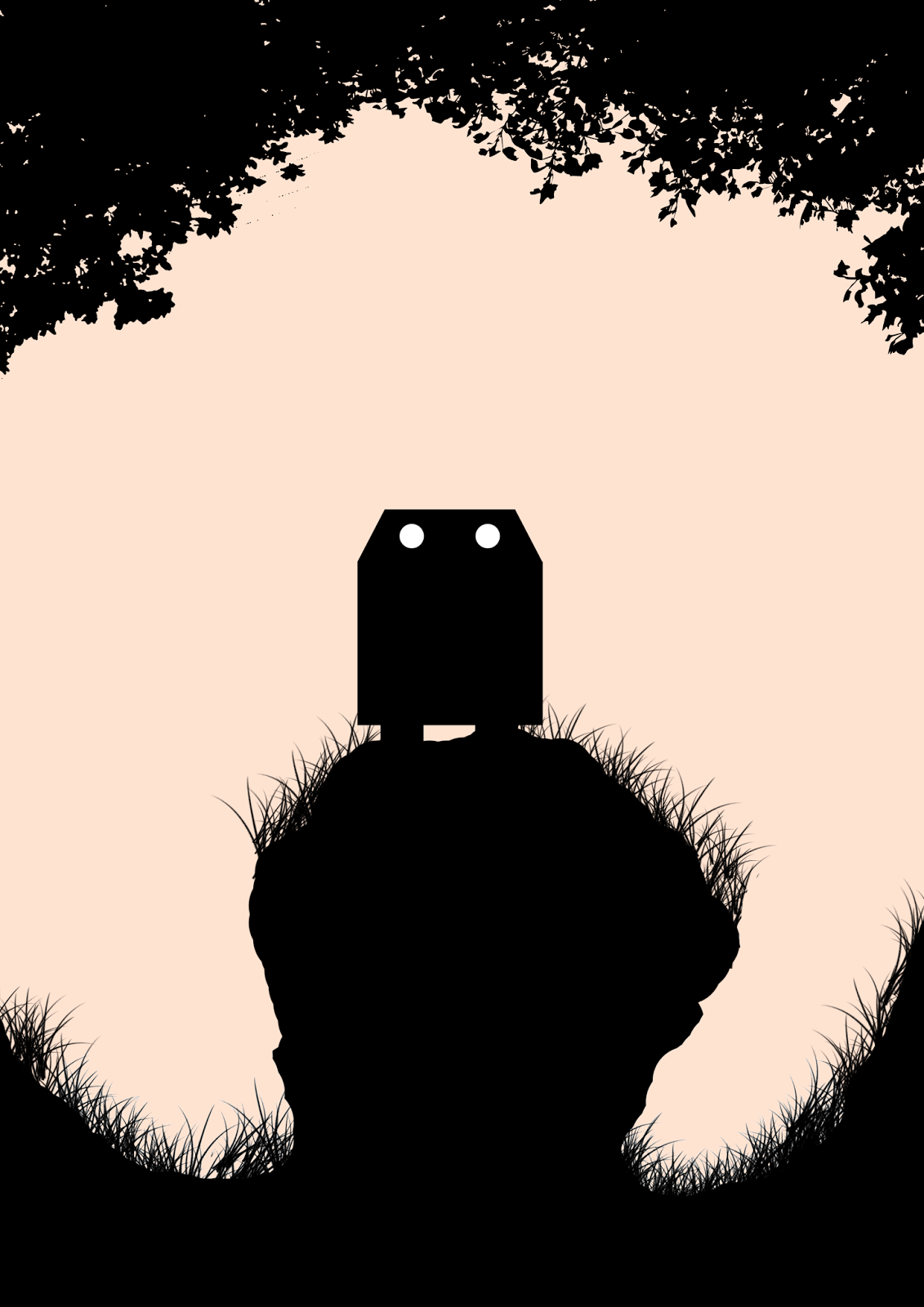
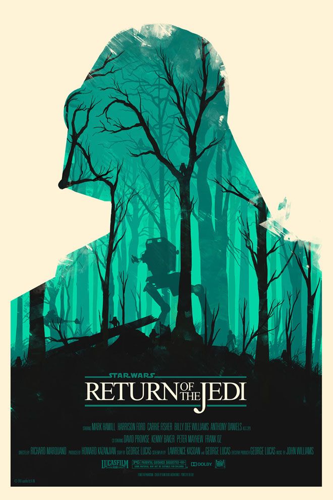 Additionally to this, all object on the poster have been replaced by their outlines filled with a coloured space-styled background. This is due to other inspirations of minimalist posters of sci-fi films and shows, which often use a single colour or multiple colours to represent a specific scene from the film or just to represent it as a whole. This minimalistic styling was incorporated into the poster due to it being quite conventional of a large amount of sci-fi films, especially in more recent posters. Another conventional part of minimalistic posters is the use of negative space, and using the environment to highlight details within what's shown to create a new image, in a matter similar to a bricolage. In my poster, I used this negative space in the poster to show the antagonist, the small ball-like robot. This is similar to the Return of the Jedi poster that I used for referencing, as the negative space in this show's the antagonist through using tree branches to denote detail. The basic shape of the antagonist is made out of the negative space on the poster, with the eye being the protagonist in the center.
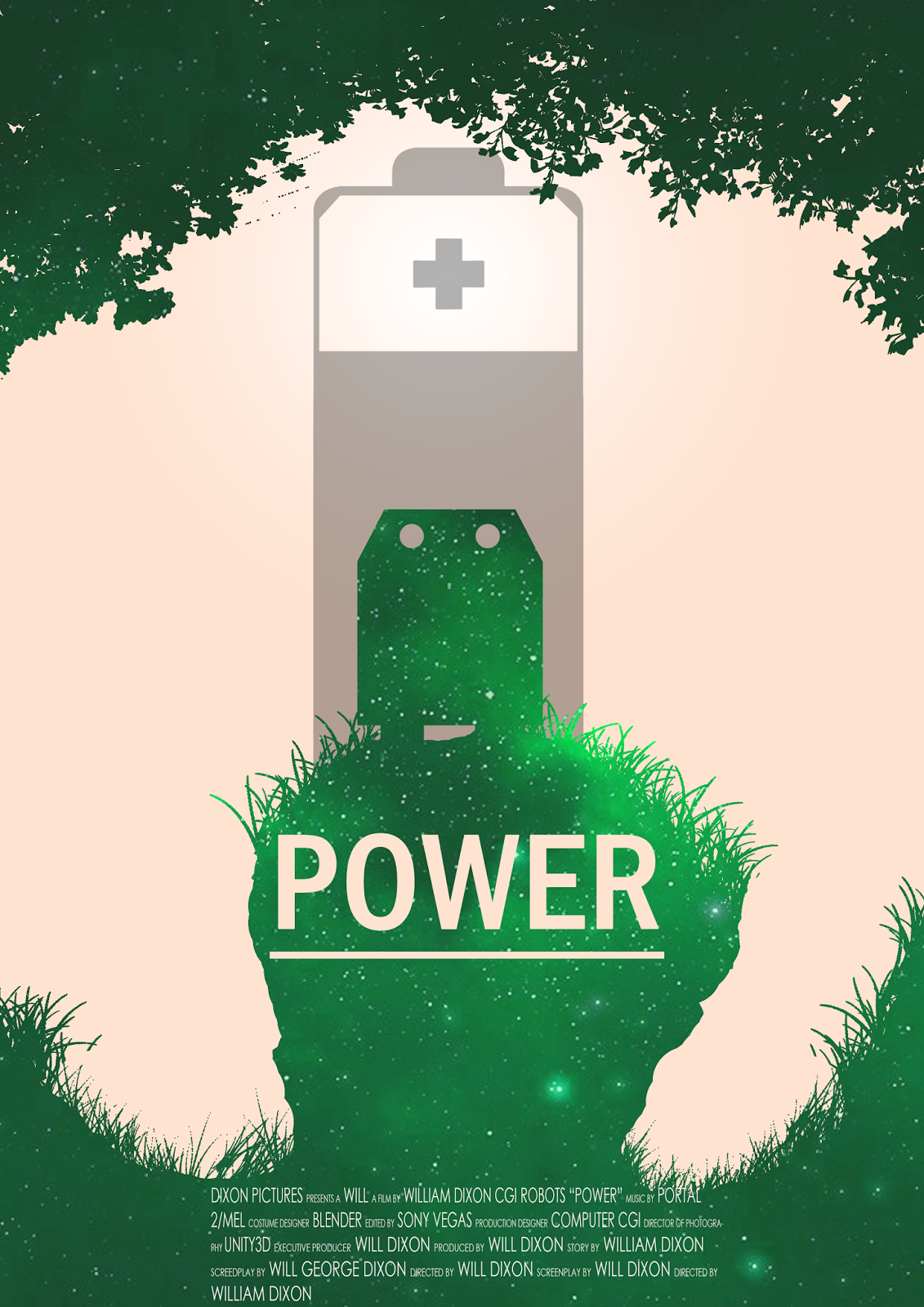
 In my magazine review, I have used a number of conventions for other film magazines, but the main example I looked at for conventions was Empire. As Empire is a popular film review magazine it seemed perfect for finding conventions relating to double page spreads and film reviews. When compared, both magazines contain similar conventions relating to layout, colour and style. My magazine makes use of a simplistic layout that is relatively uncluttered, leaving plenty of space for text. There is a review column towards the bottom, which gives a short overview of the film's details, such as plot, director and title, along with release date.
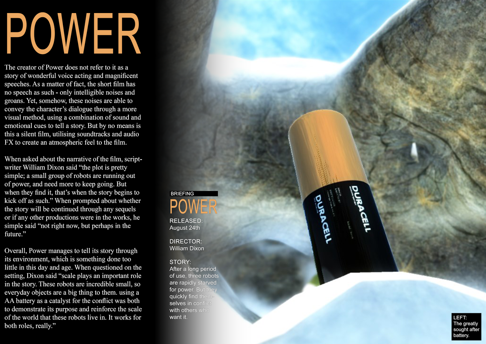
 This was done as it keeps a professional appearance, as the magazines i looked at took used a fairly long section on the film for the bulk of the story, but had a smaller, more compact review on the side. This helps people who are simply flicking through the magazine. The image used displays the battery rendered using a few more camera effects to make it seem slightly more colourful, and to increase the reflection quality of the battery itself. This was done as the battery is the main plot point of the short film, and is what drives the plot forward; this makes displaying it in promotional material very important to convey a basic concept of the story to the audience. It is often conventional to display either an object of plot importance or a character in this space, so this follows common conventions. Alongside this, there is a small box in the bottom right that explains this to the audience.
The short film follows the typical narrative structure that can be seen within most films, best broken down into Tzvetan Todorov's (1977) 5 narrative structure stages; the initial stable equilibrium, a disequilibrium is then created, this equilibrium is now acknowledged, action is taken to re-create the equilibrium, and then the creation of a new equilibrium. In this basic form, the narrative of my product can be broken down into the same five basic sections; the robots need power, the antagonist is seen observing them and then disrupting the equilibrium by planning to steal the battery, they are attacked and their power is stolen, forcing them to recognise that a disruption has taken place, action is taken to restore the equilibrium by attacking the antagonist, and then a new equilibrium is restored, having one less robot but having gained the battery. Following this basic format for a story is conventional of more genres, and while it is quickly becoming more commonplace to re-order the order of the plot within the sci-fi genre, it is still considered conventional to have this layout.
In comparing my work to Tzvetan Todorov's (1977) 5 narrative structure stages, the narrative fits in well, making good use of the conventions of regular narrative structures. this was a better convention to adhere to due to it's structure rules helping to shape the story, helping it to be more understandable and accessible by a greater audience. That being said, my product still challenges the theory through it's lack of vocals, as only incomprehensible robotic mumbles are used instead of voice acting, meaning that the entire narrative must be conveyed through a visual means. This breaks the convention of explaining everything to the audience, while still allowing the story to make sense and giving the audience a sense of understanding of the narrative.
This story was chosen over a more abstract choice due to it being largely more conventional to stick to a regular, more understandable story. Using the story concept I came up with, I wanted to attempt to head in a different direction to previous years. One of the biggest faults that I have had previously with production has been the organisation of actors and roles, but when designing this product I wanted to aim to reduce the input of other people in the film as much as possible. In doing this, I was granted a greater creative freedom throughout the creation process.
Characters are a very clear convention of most films and TV programs, and within a short film there tends to be a clear trend of having 2-3 main characters. This allows for enough time for each of these three to receive appropriate character development and for their individual traits to show through. often, these character's development is limited due to the runtime of the film, and therefore often they don't have back story or go in-depth about specifics of the character. Having a smaller cast of characters allows them to still get the development that they need for the audience to relate to them while still only having a small runtime.
To show this, the Big Bank short film promotion for Payday 2 would be a good example. It contains 3 main characters/character groups, those being the customer, the bank worker and the bank robbers. this fits the conventional character amounts for short films, and allows for enough character development to be displayed for them to play their roles to an effective standard. My character group was slightly larger then this on the whole, but generally only has 3 active characters. This is due to the Orange robot being destroyed, allowing for the Ball robot to take his place.
Within the short film, Levi Strauss' theory of binary opposites was demonstrated in the main group of robots being the protagonists, with the Ball and his backup as the antagonists. The main reason for this is due to the Ball being effectively useless without the others to back him up, whereas each of the protagonists has their own advantages. This is further shown through the protagonists each having their own dominant character trait; Orange is curios, which is shown through them being the one to break into the cavern and messing around with the IPod, Green is impetuous and impulsive, as shown by him constantly acting without thinking about the consequences of his actions, and Blue is thoughtful and the leader, as shown by him always being at the forefront (while present), and waiting for his opportunity to jump on the Ball. This is contrasted by the binary opposite; the antagonists. They are very alike and work in almost a hive mind; they don't think for themselves as much as they just act together in a mechanical and have more of a sudden, jerking motion to them when they move.
Overall, my film meets a large amount of the conventions set out by other short films, as well as conforming to a number of theories that are help common in the practise of film making. In meeting these conventions, I have made my work appear more professional through abiding by the rules set out by popular and well known films, as well as broken some to ensure that my short film is still something fresh and interesting to the viewer.
Throughout the process of creating my products, and the development of the short film, I have attempted to keep the products as professional as possible. In order to do this, I decided to stick to conventions for the most part, but still wanted to allow my creativity to come through, and therefore broke some conventions in order to keep the content of the short film fresh and different. Within this evaluation, the conventions and how they are broken or conformed to within my short film, poster and magazine spread will be analysed to show their usage or breakage of conventions.
The short film has conformed to a large amount of the conventions within the genre and medium, but has still broken conventions of the form itself. The reason I chose to break conventions was due to wanting to make the short film slightly different in order to keep it as something new, within reason. some of the conventions that exist within this products are based around it's narrative ability and environments. Often in science fiction short films, snow and icy conditions are used in order to present a setting that represents the rough lives of the main characters, but in my film I used this setting to forward the plot through showing what the protagonists could do, which would become important later on.
 In my poster ancillary text, I have opted to use the conventions found within a large amount of posters of displaying the main character in the center and an object of plot importance in the background behind them, with surrounding scenery and borders covered with a similar theme to the main setting of the film. In this case, I have used trees and grass around the edge to create a boarder, to which the character is in the middle. The battery, an important plot point in the film, is shown as very large and behind the main character, with a glow around it to draw the viewer's attention to it as the main focus of the film. This is conventional, and through researching the products i learned that these positions are common not only on short film posters or even posters of the genre, but that they expand to other genres too, such as action and adventure films.Additionally to this, all object on the poster have been replaced by their outlines filled with a coloured space-styled background. This is due to other inspirations of minimalist posters of sci-fi films and shows, which often use a single colour or multiple colours to represent a specific scene from the film or just to represent it as a whole. This minimalistic styling was incorporated into the poster due to it being quite conventional of a large amount of sci-fi films, especially in more recent posters. Another conventional part of minimalistic posters is the use of negative space, and using the environment to highlight details within what's shown to create a new image, in a matter similar to a bricolage. In my poster, I used this negative space in the poster to show the antagonist, the small ball-like robot. This is similar to the Return of the Jedi poster that I used for referencing, as the negative space in this show's the antagonist through using tree branches to denote detail. The basic shape of the antagonist is made out of the negative space on the poster, with the eye being the protagonist in the center.
 In my magazine review, I have used a number of conventions for other film magazines, but the main example I looked at for conventions was Empire. As Empire is a popular film review magazine it seemed perfect for finding conventions relating to double page spreads and film reviews. When compared, both magazines contain similar conventions relating to layout, colour and style. My magazine makes use of a simplistic layout that is relatively uncluttered, leaving plenty of space for text. There is a review column towards the bottom, which gives a short overview of the film's details, such as plot, director and title, along with release date.
The short film follows the typical narrative structure that can be seen within most films, best broken down into Tzvetan Todorov's (1977) 5 narrative structure stages; the initial stable equilibrium, a disequilibrium is then created, this equilibrium is now acknowledged, action is taken to re-create the equilibrium, and then the creation of a new equilibrium. In this basic form, the narrative of my product can be broken down into the same five basic sections; the robots need power, the antagonist is seen observing them and then disrupting the equilibrium by planning to steal the battery, they are attacked and their power is stolen, forcing them to recognise that a disruption has taken place, action is taken to restore the equilibrium by attacking the antagonist, and then a new equilibrium is restored, having one less robot but having gained the battery. Following this basic format for a story is conventional of more genres, and while it is quickly becoming more commonplace to re-order the order of the plot within the sci-fi genre, it is still considered conventional to have this layout.
In comparing my work to Tzvetan Todorov's (1977) 5 narrative structure stages, the narrative fits in well, making good use of the conventions of regular narrative structures. this was a better convention to adhere to due to it's structure rules helping to shape the story, helping it to be more understandable and accessible by a greater audience. That being said, my product still challenges the theory through it's lack of vocals, as only incomprehensible robotic mumbles are used instead of voice acting, meaning that the entire narrative must be conveyed through a visual means. This breaks the convention of explaining everything to the audience, while still allowing the story to make sense and giving the audience a sense of understanding of the narrative.
This story was chosen over a more abstract choice due to it being largely more conventional to stick to a regular, more understandable story. Using the story concept I came up with, I wanted to attempt to head in a different direction to previous years. One of the biggest faults that I have had previously with production has been the organisation of actors and roles, but when designing this product I wanted to aim to reduce the input of other people in the film as much as possible. In doing this, I was granted a greater creative freedom throughout the creation process.
Characters are a very clear convention of most films and TV programs, and within a short film there tends to be a clear trend of having 2-3 main characters. This allows for enough time for each of these three to receive appropriate character development and for their individual traits to show through. often, these character's development is limited due to the runtime of the film, and therefore often they don't have back story or go in-depth about specifics of the character. Having a smaller cast of characters allows them to still get the development that they need for the audience to relate to them while still only having a small runtime.
To show this, the Big Bank short film promotion for Payday 2 would be a good example. It contains 3 main characters/character groups, those being the customer, the bank worker and the bank robbers. this fits the conventional character amounts for short films, and allows for enough character development to be displayed for them to play their roles to an effective standard. My character group was slightly larger then this on the whole, but generally only has 3 active characters. This is due to the Orange robot being destroyed, allowing for the Ball robot to take his place.
Within the short film, Levi Strauss' theory of binary opposites was demonstrated in the main group of robots being the protagonists, with the Ball and his backup as the antagonists. The main reason for this is due to the Ball being effectively useless without the others to back him up, whereas each of the protagonists has their own advantages. This is further shown through the protagonists each having their own dominant character trait; Orange is curios, which is shown through them being the one to break into the cavern and messing around with the IPod, Green is impetuous and impulsive, as shown by him constantly acting without thinking about the consequences of his actions, and Blue is thoughtful and the leader, as shown by him always being at the forefront (while present), and waiting for his opportunity to jump on the Ball. This is contrasted by the binary opposite; the antagonists. They are very alike and work in almost a hive mind; they don't think for themselves as much as they just act together in a mechanical and have more of a sudden, jerking motion to them when they move.
Overall, my film meets a large amount of the conventions set out by other short films, as well as conforming to a number of theories that are help common in the practise of film making. In meeting these conventions, I have made my work appear more professional through abiding by the rules set out by popular and well known films, as well as broken some to ensure that my short film is still something fresh and interesting to the viewer.
Friday 15 April 2016
Evaluation Question 2 - How Effective is the Combination of your Main Product and Ancillary Texts?
How Effective is the Combination of your Main Product and Ancillary Texts?
Thursday 14 April 2016
Evaluation Question 3 - What Have You Learned from your Audience Feedback?
What Have You Learned from your Audience Feedback?
http://jameswestonisthebeston.blogspot.co.uk/2014/04/short-film-bernard-bird-audience.html
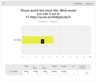
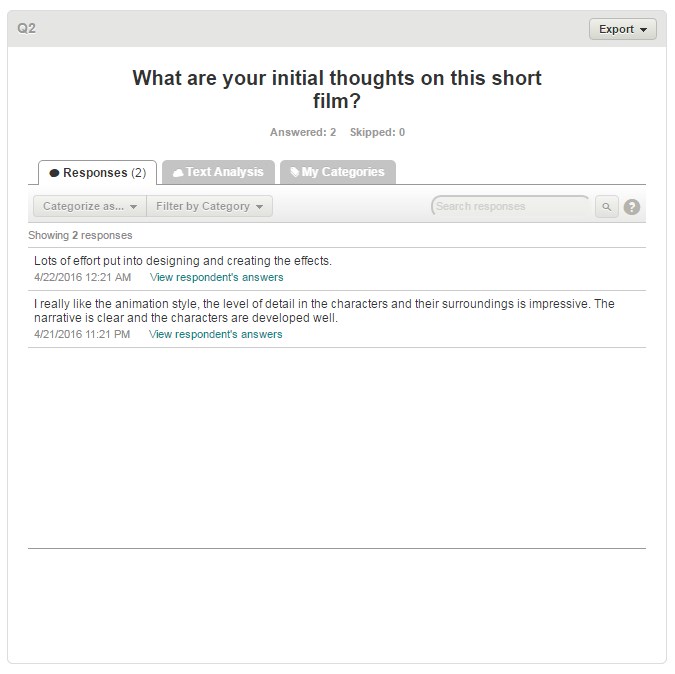
In order to gather audience feedback, I used Survey monkey to get opinions and ratings on my products. This consisted of a questionnaire, which was distributed to a few people which cover a wide audience range. The age group that was used is around the 17-19 area, as that is the intended audience for the film. The film was shown to all of these, which then were given the survey to complete. The results shows the two most common groups that these people fell into.
This is the survey's first question, filled with the two most popular answers. Both of these are very good reflections on my film, as they give good ratings for the film. Given that this is immediately after viewing, this is good, as it leaves an impression upon the viewer. The other questions reflect this, as they will have been answered slightly after seeing the film, and they remain positive results. Using this information, I have learned that my film is popular with my target audience, and that it as therefore been successful.


http://jameswestonisthebeston.blogspot.co.uk/2014/04/short-film-bernard-bird-audience.html
In order to gather audience feedback, I used Survey monkey to get opinions and ratings on my products. This consisted of a questionnaire, which was distributed to a few people which cover a wide audience range. The age group that was used is around the 17-19 area, as that is the intended audience for the film. The film was shown to all of these, which then were given the survey to complete. The results shows the two most common groups that these people fell into.
This is the survey's first question, filled with the two most popular answers. Both of these are very good reflections on my film, as they give good ratings for the film. Given that this is immediately after viewing, this is good, as it leaves an impression upon the viewer. The other questions reflect this, as they will have been answered slightly after seeing the film, and they remain positive results. Using this information, I have learned that my film is popular with my target audience, and that it as therefore been successful.


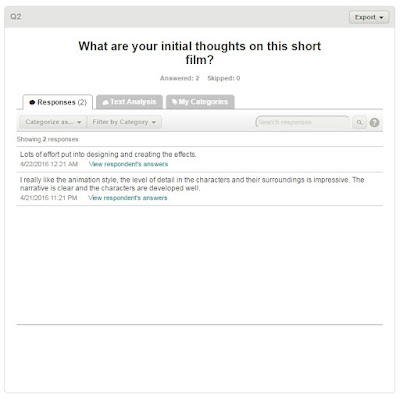
Overall, the Feedback that I have received from the popular answers to the questionnaire are mostly positive. Within question one, both groups gave good ratings, with one being 4 stars and one being 5. Due to one of these being lower then the other, this shows that there is still room for improvement. Question 2 was similarly well received, with answers relating to the level of detail and effects being the most common. alongside this, comments were also made about the animation quality, as well as the characters and narrative developed.
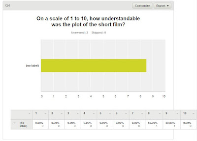
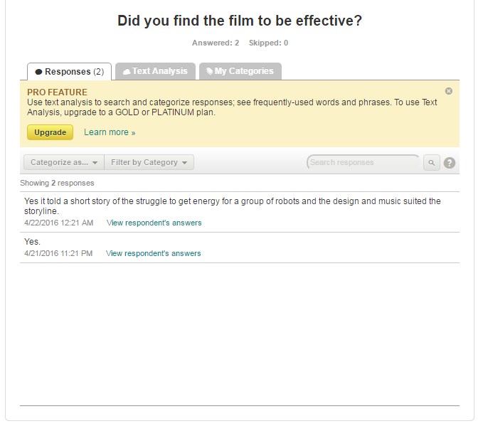
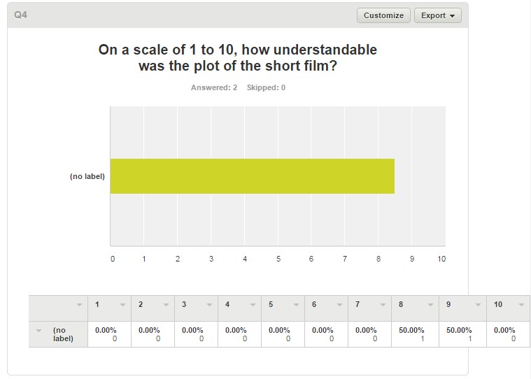
On Question 3, both groups found that the film was effective in it's narrative and visual style, long with the music. This also leaves room or improvement, but is a good starting point, and shows the film, as being popular with these groups. For Question 4, both groups answered highly, with one giving an 8 and the other giving a 9. However, these ratings could be improved, and therefore the method through which the narrative is explained requires improvement in order to be the best that it can be.
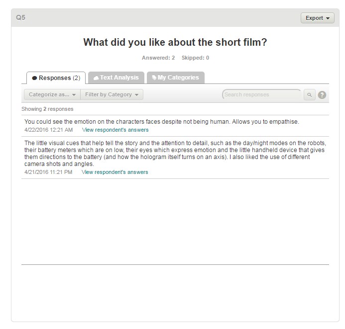
For Question 5, both groups had comments to write about the film, both being good. The first group answered with a shorter answer, mentioning the robot's eyes and faces being more effective due to their mobility, allowing for a greater range of emotions to be expressed, which the group notes allows the audience to empathize better. The second group's responses are far larger and much more detailed, mentioning about how there are small visual cues that help to tell the story, to which they then go on to examples from the short film, such as the day/night modes, the eyes on the robots along with the small device that directs them to the battery. They also go on to mention the cinematography of the film, mentioning that they liked the use of camera shots and angles.
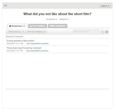
Within Question 6, the question asks for dislikes about the film, but the responses do not list much that they didn't like. The first group mentions the ending, saying that it seemed somewhat sudden, which is a complaint that I agree with. Unfortunately, due to the time constraints of the video, a more elaborate ending was not able to be added, but it should be something that could be tweaked should the beginning be shortened or simplified. As for the second group, they had no dislikes that they commented on in the film.
Overall, with these responses being very positive, The reviews reflect that the audience likes the film. However, this does not mean that it is without flaws. Within the 'What Improvements Would You Recommend?', the common responses were that the scenes earlier on in the film should be shortened down in order to focus more on the ending. Following this advice would allow for more time to focus on the ending, as suggested, and make more of the finale. This could make the ending more satisfying for the viewer, leaving the film with a better and more memorable final scene which is longer and more plot-related.
The other comment on this question is that the sound effects could have been better utilized. They point out specifically the robot's 'voices', saying that they should be used more within the film, as well as that more ambient sounds and noises could have been used. This is something that I agree with, and on reflection more sounds could have been added. From this feedback, I have learnt that the audience would like the pacing of the film to be altered, as well as sound and dialogue effects.
Wednesday 13 April 2016
Evaluation Question 4 - How Did You Use Media Technologies in the Construction and Research, Planning and Evaluation Stages?
How Did You Use Media Technologies in the Construction and Research, Planning and Evaluation Stages?
Throughout the development of my short film, I had primarily used different software and hardware in order to make it, as the CGI required a large amount of technological involvement in order to work. One of the two most important programs in the making of the film was Unity3D, the 3D graphical engine that I created my animation in. To give demonstrations of how this has been used, along with the 3D modelling tool Blender, an interactive guide to the assets used throughout the film is given in the demo below.
https://drive.google.com/open?id=0ByeAkfBNgEqsUkFUdFZyTFFuMGc
Tuesday 12 April 2016
Ancillary Text 1: Draft Poster
Using the minimalist styling shown in the research for my poster, along with the posing demonstrated by the short film posters, I have began to draft a poster using a combination of these features.


Thursday 24 March 2016
Ancillary Text 1: Poster for the Film - Research
There are few short film posters that feature similar themes to my film, but i have managed to find a few to take inspiration and ideas from. I would like to create a pastiche of these posters using my protagonists as the centerpiece, and then put them together in the form of a bricolage to create something new. there are a few posters that i will be taking inspiration from, all of which revolve around the sci-fi theme to keep consistency and genre throughout the poster. some of the ideas that i am currently thinking about including would be the use of shadows and silhouettes, minimalist two-colour styles and a use of negative space.
Some of the posters that I am considering taking inspiration from would be from various short films that focus around similar subjects, i.e. sci-fi, robots, machinery and the cold winter themes that run throughout the setting. for the poses and object arrangement within the poster, I will take a look at the following posters:


Some of the posters that I am considering taking inspiration from would be from various short films that focus around similar subjects, i.e. sci-fi, robots, machinery and the cold winter themes that run throughout the setting. for the poses and object arrangement within the poster, I will take a look at the following posters:
These give a large range of ideas for inspiration in terms of how the poster should be structured, but for the styling of the poster, I will be taking a different route. A style that makes for a very simple but eye-catching poster is using minimalist styles to represent the film, with basic colours and shapes. Alongside this, a large amount of minimalistic posters make a use of negative space to represent an image within the image, while not directly depicting said image. This is done more through the lack of imagery within a certain area (such as the posters demonstrated below).
Using a combination of these styles, I believe that the poster will conform to the conventions of object arrangement within the poster, but that the styling of the poster will help to set it apart from other short film posters.
Friday 12 February 2016
Media Short Film - First Full Draft
The first draft of my media short film is finished! This contains all of the scenes that are in the final film.
Wednesday 3 February 2016
New Hardware!
Recently, I purchased a new £200 graphics card for my computer. In terms of my animation, this gives me the potential to create a far better end product, as more camera effects, bigger and more expansive sets and more ambitious particle and lighting effects can be achieved. Alongside this, I may be able to complete my original intention of filming the entire short film in 60 frames per second, giving the finished result a much smoother look and finish.
With this in mind, I am altering the original story that I had in mind slightly to incorporate some of the initial ideas that I had but was at the time unable to use, such as multiple antagonists and a larger scale fight at the end. This larger scale fight will use some of the models I initially made for this project, but scrapped due to their high-requirements. Some of those are as follows:
Along with various other scenery objects (walls, platforms etc), these are some of the previous ideas that can be now incorporated into the short film, either taking on similar roles to their original intention or being changed to fit the more up to date narrative. The narrative changes effect little of the story, but are largely just a few shots placed into the pre-existing scenes in order to set up the antagonist more, as well as introducing a new plot point that will be used in the finale (a small Ipod-like device that will play a song and it's music video when one of the protagonists accidentally activates it). This will, of course, lead to changes being placed within the finale, as it will be done on a much grander scale then previously planned to be.
With this in mind, I am altering the original story that I had in mind slightly to incorporate some of the initial ideas that I had but was at the time unable to use, such as multiple antagonists and a larger scale fight at the end. This larger scale fight will use some of the models I initially made for this project, but scrapped due to their high-requirements. Some of those are as follows:
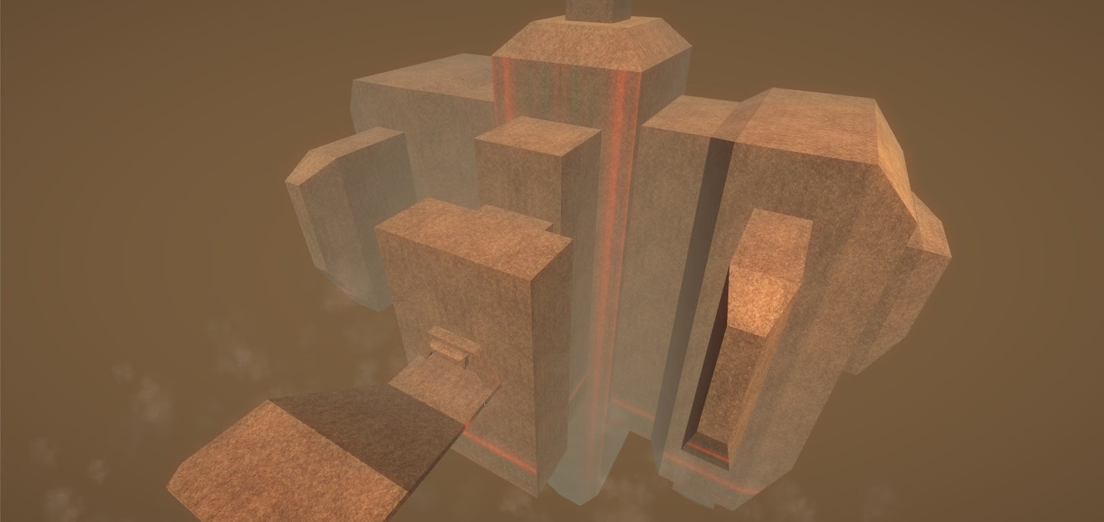
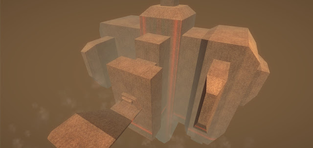
The large areal fort that the antagonists will reside in, and the protagonists will have to infiltrate
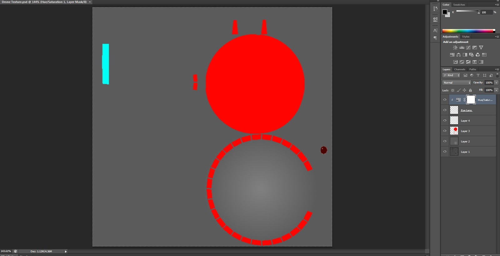
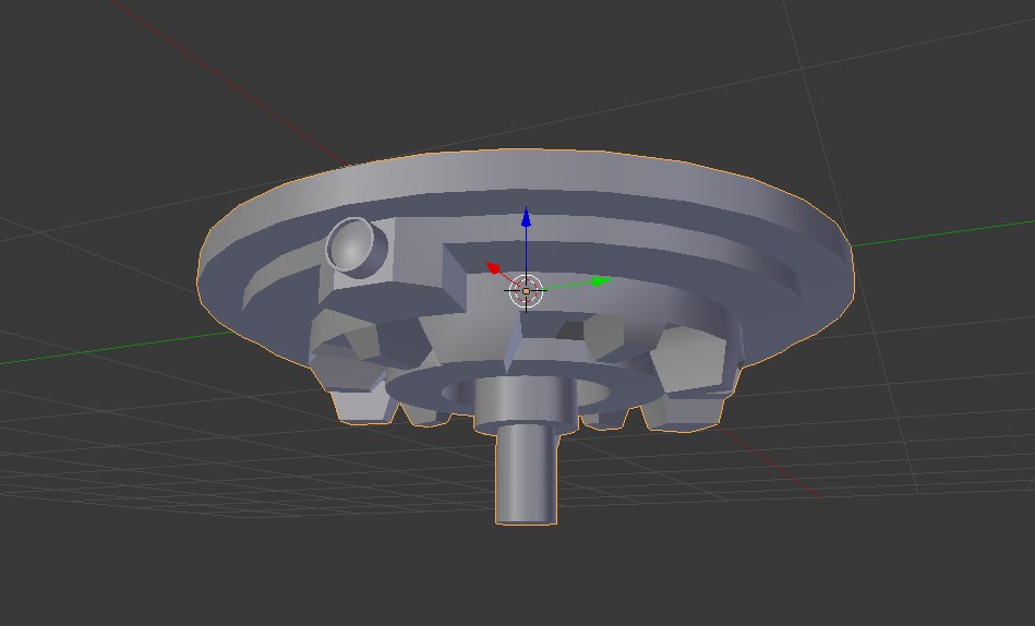
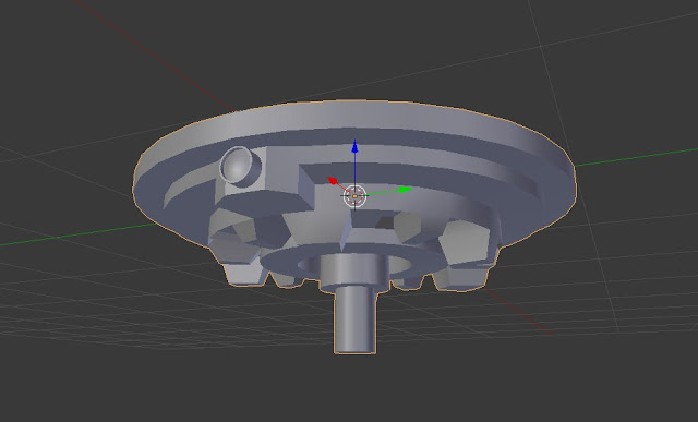
Small Drone used by the antagonists as a smaller form of henchmen (Note: This model got as far as having it's colours textured before being scrapped)
Along with various other scenery objects (walls, platforms etc), these are some of the previous ideas that can be now incorporated into the short film, either taking on similar roles to their original intention or being changed to fit the more up to date narrative. The narrative changes effect little of the story, but are largely just a few shots placed into the pre-existing scenes in order to set up the antagonist more, as well as introducing a new plot point that will be used in the finale (a small Ipod-like device that will play a song and it's music video when one of the protagonists accidentally activates it). This will, of course, lead to changes being placed within the finale, as it will be done on a much grander scale then previously planned to be.
Subscribe to:
Posts (Atom)